22 March 2010
Design for Space
A couple of years ago, I attended a workshop about inbetweeness conducted at the Bartlett school of architecture by Arianna Bassoli, Johanna Brewer and Karen Martin.
I read about a project today that reminds me of the themes that were addressed then. Artist Julien Prévieux and students of a technical graduating program in space design worked in the MAC/VAL museum to build substitution furniture for "missing" spaces in their high-school : private places for discussion, work or social activities..


I read about a project today that reminds me of the themes that were addressed then. Artist Julien Prévieux and students of a technical graduating program in space design worked in the MAC/VAL museum to build substitution furniture for "missing" spaces in their high-school : private places for discussion, work or social activities..
Labels: Design, inbetweeness, Space
12 December 2009
Design for Attention
La fondation Abbé Pierre launched last Wednesday its yearly campaign against indecent or no housing.
Fake mailboxes were installed on buildings at the level of basement windows, in the République and Bastille districts of Paris, to bring awareness to the situation of millions of people who live in poor conditions or on the streets.

I tried to think many times about projects that could bring moments of connection between passers-by and people living in the streets. It's a tough subject, in so many ways. This latest activist action from la fondation Abbé Pierre is brilliantly smart and subtle. It's not coming from an art angle at all but it's a great example for non-intrusive, respectful designs that call for attention to a living situation that is often looked at in a very abstract way from a distant point of view.
--Joëlle

Fake mailboxes were installed on buildings at the level of basement windows, in the République and Bastille districts of Paris, to bring awareness to the situation of millions of people who live in poor conditions or on the streets.
I tried to think many times about projects that could bring moments of connection between passers-by and people living in the streets. It's a tough subject, in so many ways. This latest activist action from la fondation Abbé Pierre is brilliantly smart and subtle. It's not coming from an art angle at all but it's a great example for non-intrusive, respectful designs that call for attention to a living situation that is often looked at in a very abstract way from a distant point of view.
--Joëlle
Labels: Design, Distance, fondation Abbé Pierre, Precariousness
03 November 2009
The new new testament
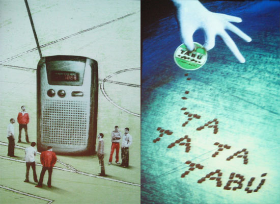
In these days of brought out of blue ridiculous debate over national identity in France, one book comes to mind that I was shown by David G. last time I visited in Milan in spring this year. "Italianità" curated by Giulio Iacchetti is an amazing graphic design book that captures the essence of what it is to be Italian or, like the Wiktionary defines, "the peculiarities of Italians or their language or culture". 30 of those peculiarities are picked and commented (and beautifully illustrated by ale+ale), such as the Tabu licorice box, the Sambuca drink, the voting card, the Tabacchi sign, the comics Diabolik, the Gazzetta dello Sport, etc...
I guess it has to do with pop culture and daily life. The little things that you don't pay attention to much, that you might not share an interest about, but that are part of the landscape of signs that surround you. And in this regard, I find it easy to adopt a culture wherever I go. Parts of me are italian, french, japanese, israeli, american, british... I never think about these things really, they come naturally to me. I dislike the expression "citizen of the world", it resonates very dull in my mind. I just experience very strong cultural bonds wherever I go, wherever I live. I find myself enjoying the local lifestyle with a twist of my own blend. Usually, it comes first through experiencing food, graphic design, architecture, cinema and fashion. Which is probably why I hate shopping at Zara, H&M, Ikea and The Gap because you can find the stores everywhere.
I do have a problem though of adjusting to my own city, my own country. After all these years, I still haven't figured out how I can change the fact that I don't feel free in Paris. It gets on my nerves because I'd like to be able to stay in one place. Therefore the question for me is certainly not what is a national identity but what makes a place a home.
--Joëlle
Labels: Culture, Design, identity, Pop Culture
24 April 2009
Milano pre-Salone
The Salone del Mobile opened yesterday in Milan. The city's main design event of the year is much more than a "furniture fair" or what the idea of one would lead you to think - take in your perspective for instance that Wall Paper has a special section in its website covering the event live. The "Salone" as it's simply called is also one of the 2 party excuses that takes the city in a whirl of openings, shows, places to be (or depending of your perspective - places not to be). The other one is, of course, the fashion week.
As my calendar worked it out, I actually spent a few days as a spring break in Milan the week before the Salone - I was warned though that I would find the city "shut down". Well, that wasn't totally the case... A lot of galleries were "closed" indeed but still a lot of things were going on in and out of them - because of the preparation! That was a show in itself... so all over town you'd see skeletons of unidentified objects, covered with plastic sheets..

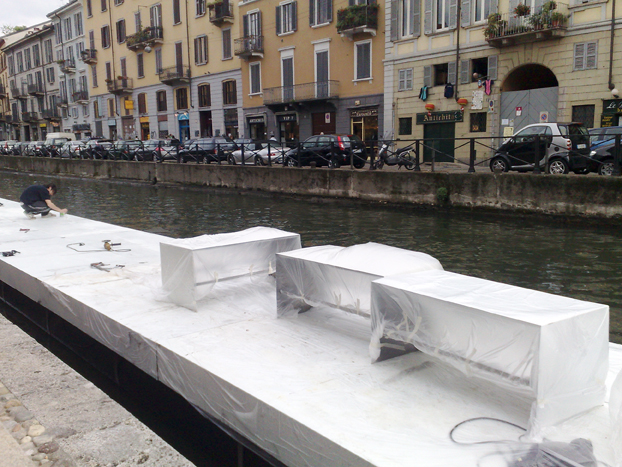


As my calendar worked it out, I actually spent a few days as a spring break in Milan the week before the Salone - I was warned though that I would find the city "shut down". Well, that wasn't totally the case... A lot of galleries were "closed" indeed but still a lot of things were going on in and out of them - because of the preparation! That was a show in itself... so all over town you'd see skeletons of unidentified objects, covered with plastic sheets..
Labels: Design, Furniture, Galeries, Milan, Process, Salone, Wall Paper
03 October 2008
THE UPGRADE! PARIS #18 with Etienne Mineur
This evening, the amazing interaction designer Etienne Mineur is giving a talk within the context of The Upgrade! Paris. He's going to present his experimental work carried out for major international companies, like Issey Mikaye. Etienne is one of the few people I know who's able to be edgy, ambitious and explorative within a web commercial context. In his blog, My-Os,he regularly presents his work and reviews with a sharp eye things he likes or dislikes (mostly anything related to the French national train company SNCF's communication).
I've first met him as my teacher at the Fine Arts school almost ten years ago and he's still the same humble and enthusiastic person that he was then. I'll be happy to moderate this talk this evening at the invitation of Julie Morel, who organises The Upgrade! Paris with Incident.net.
-- Joëlle
THE UPGRADE! PARIS #18
Etienne Mineur / at Beton Salon, Paris - 3 oct. 08, 7pm
(English below)
• Beton Salon
9 esplanade Pierre Vidal-Naquet.
Rez-de-Chaussee de la Halle aux Farines.
75013 Paris.
Underground station: Bibliotheque F. Mitterand
+33.(0)1.45.84.17.56
For the last 3 years, Etienne Mineur has developed www.my-os.net. The blog’s aim is to enquire about the relation between graphic design and technologies. For Upgrade! # 18, he will present his interactive projects, focussing on his experiments for Issey Miyake.
Born in May 1968. Art director for many independent agencies such as “Hyptique” (Paris) and “Nofrontiere” (Vienna, Austria), Etienne has also co-founded “Incandescence” and work there as the artistic director.
Moderation: Joelle Bitton. Joelle Bitton is an artiste, an interactive designer, and the founder of Superficiel.org.
http://incident.net/theupgrade
upgrade@incident.net
Thanks to Melanie Bouteloup & Beton Salon Team.
Labels: Design, Etienne Mineur, Interaction, The Upgrade Paris, Web
24 September 2007
Portrait, Restored
A new look and feel for my online portfolio: the content is restructured around a denser information architecture and the colors are darker. I thought that after almost 3 years since I first designed it, it needed some face lift like when you redo the painting in your house. It also makes better sense that way in my current job hunting strategy, the efficiency of which I'll report about later...

06 July 2007
For Sale
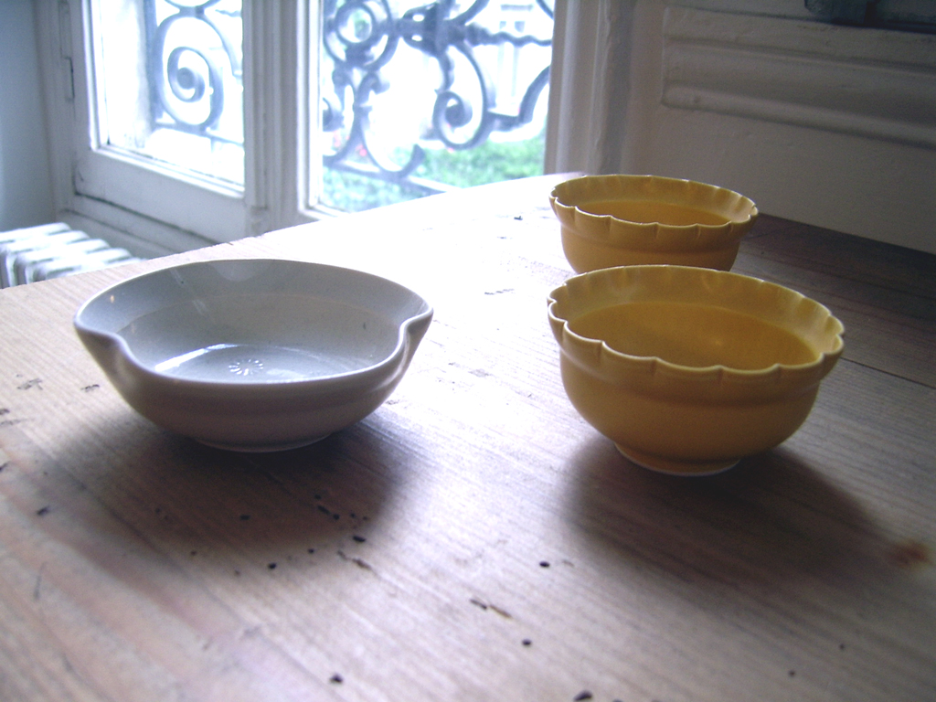
Last time I went to Japan, I brought back with me beautiful deco objects, that I found either in Tokyo or in Kyoto.
I'm travelling there again in 3 weeks to exhibit an installation.
I will also shop again for striking singular objects and I decided this time to take orders in advance to see if I can make a revenue out of my numerous trips around the world.
Here's a sample of different objects I got last time from amazing handcrafters: very thin porcelain hand-painted sake glass, ceramic cups designed after flower shapes, sake set, glass bottles, worked-metal plates and utensils, dyed textiles to hang on walls or use in the kitchen, genmaicha or hojicha teas... To give you an idea, prices varied for these between 10 euros and 100 euros.
If you're interested in details, let me know: joelle |at| superficiel.org


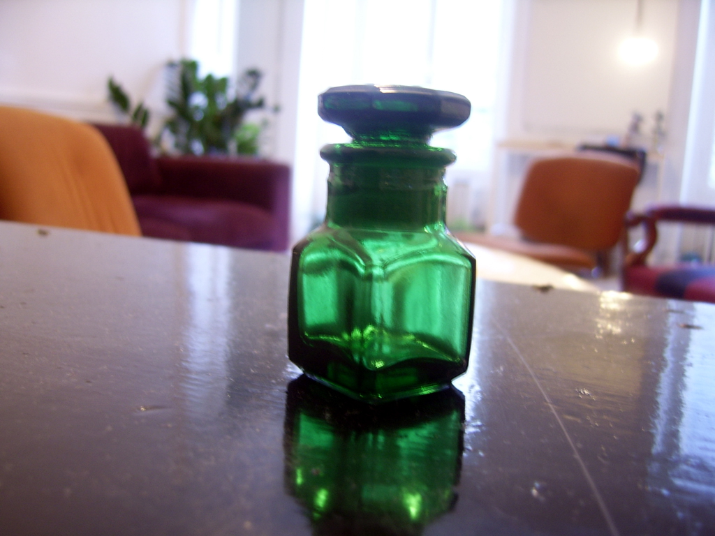
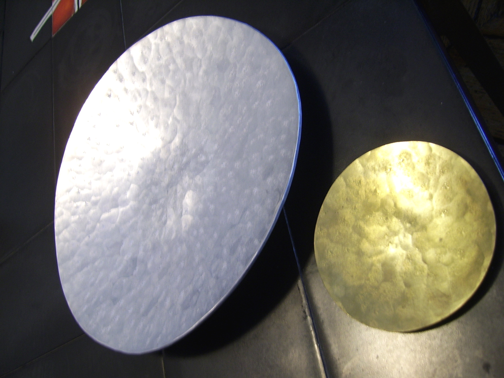

--Joëlle
I'm travelling there again in 3 weeks to exhibit an installation.
I will also shop again for striking singular objects and I decided this time to take orders in advance to see if I can make a revenue out of my numerous trips around the world.
Here's a sample of different objects I got last time from amazing handcrafters: very thin porcelain hand-painted sake glass, ceramic cups designed after flower shapes, sake set, glass bottles, worked-metal plates and utensils, dyed textiles to hang on walls or use in the kitchen, genmaicha or hojicha teas... To give you an idea, prices varied for these between 10 euros and 100 euros.
If you're interested in details, let me know: joelle |at| superficiel.org
--Joëlle
Labels: Deco, Design, Japan, Sale
17 June 2007
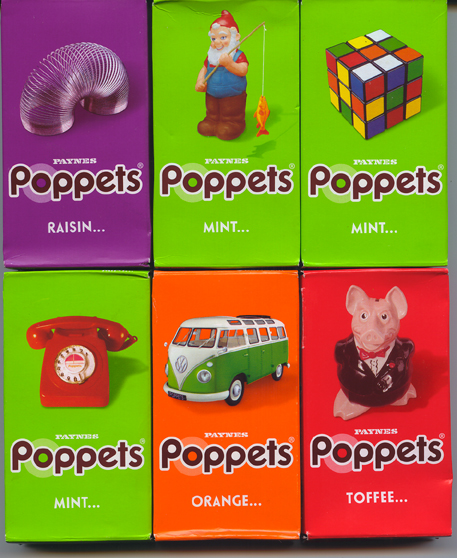
Superdrugs
In England, it's fun to shop, even at the pharmacy. Mainly because of the packaging of products: lots of nice colours combinations, attractive layouts, great fonts, texts that talk to you (the customer) as a friend ("pop by anytime at our headquarters"), etc...
I had to bring back few samples.
Poppets are yummy chocolate sweets filled with toffee (the yummiest), mint cream, raisins or orange cream first launched in 1937 and they underwent a major lifting last year. I just noticed them so I guess the new marketing plan works well.
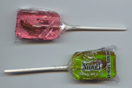
Other candy temptations are sugar-free Hotlix's lollipop with a cricket twist.. I guess, they're surfing on Edible's wave that I wrote about in this blog a couple of years ago ("The last culinary territory to conquest"). I came across the lollipops as they were given away during the Go-North festival, a rock/folk music festival taking place in Inverness this year. I'm not sure I got the obvious link between the 2 themes. Maybe as a hommage to rock bands from the fifties and sixties who bore insect names like the Beatles?
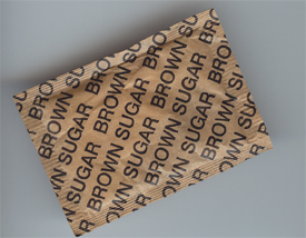
More sugar: I like the straightforwardness of this one.
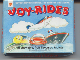
A candy look-and-feel but very medical: anti-travel sickness tablets. The packaging makes you want to ride again and again so you get to take one of their pills and feel so happy to be traveling.
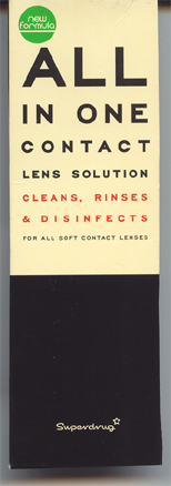
Finally, I've always been attracted to designs that use the famous eye-doctor test board. I know it's a classic but in this case, it's very appropriate. Also, it's the best design ever I've seen for a contact lens solution. And it's made by a chain and they usually don't put so much effort into their own product packages, so it's something to acknowledge.
-- Joëlle.
I had to bring back few samples.
Poppets are yummy chocolate sweets filled with toffee (the yummiest), mint cream, raisins or orange cream first launched in 1937 and they underwent a major lifting last year. I just noticed them so I guess the new marketing plan works well.
Other candy temptations are sugar-free Hotlix's lollipop with a cricket twist.. I guess, they're surfing on Edible's wave that I wrote about in this blog a couple of years ago ("The last culinary territory to conquest"). I came across the lollipops as they were given away during the Go-North festival, a rock/folk music festival taking place in Inverness this year. I'm not sure I got the obvious link between the 2 themes. Maybe as a hommage to rock bands from the fifties and sixties who bore insect names like the Beatles?
More sugar: I like the straightforwardness of this one.
A candy look-and-feel but very medical: anti-travel sickness tablets. The packaging makes you want to ride again and again so you get to take one of their pills and feel so happy to be traveling.
Finally, I've always been attracted to designs that use the famous eye-doctor test board. I know it's a classic but in this case, it's very appropriate. Also, it's the best design ever I've seen for a contact lens solution. And it's made by a chain and they usually don't put so much effort into their own product packages, so it's something to acknowledge.
-- Joëlle.
Labels: Design, Graphic design, Packaging design
![]()
