08 February 2009
Get a Plan C says the New York Times
Looking at the crisis often lead to creative and facetious comments, like this brand logos analogy (by Ji Lee) illustrating an article of the New York Times, What's your new Plan B?
My favorite is Cipriani vs McDonald's...

My favorite is Cipriani vs McDonald's...
Labels: Brands, Crisis, Graphic design, Logos, New York Times
05 January 2008
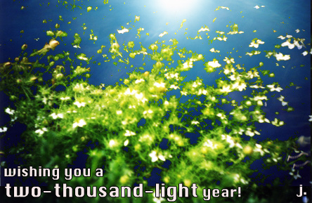
Two-thousand-light
The fun of New Year's wishes has started for few days, and I receive all kind of nice things, by SMS, email or in Facebook... Hardly with postcards anymore, although there's always one or two that manage to survive the electronic way. I saw on TV last day an archived news report from the Seventies that was mentioning the booming industry of Xmas / New Year's wishes cards in France, following the success of Hallmarks and the sort in the States. The illustrations on the cards were particularly over cute and way too sweet, with cats or littles girls and boys or flowers... I don't think I miss them too much. But it was interesting to be able to compare the old connection modes with the new ones.
I got a really nice card last year from Yaeko, a woman I had met randomly in Kyoto (a bike story). In Japan, indeed, there's still a strong tradition to send your wishes by way of cards and available for that are amazing designs, sometimes using origami, paper cuts, depths and embosses.. a beautiful selection can be found at Ito-Ya in Tokyo Ginza, the temple of paper products.
But with the expansion of means of communication and the number of possible contacts that come with it, it's time consuming - and expensive - to write and send letters to hundreds of people. Yet, electronically, I have a lot of fun trying to come-up with something creative. I think it's Anne with her look at that kind of work, which for her sets the tone of her social communication, who made me want to have a go at it.
So there it is, with a mix of two pictures I took with my Lomo camera in september 2001 - one was in the fields of the Fontevraud Abbey and the other one at a party in Karlsruhe. I wanted to get across the idea of lights for this year, in a peaceful and vivid reverie setting, in a way to wish to my friends peace of mind and freedom of imagination.
Labels: Cards, Communication, Contacts, Graphic design, Japan, Wishes
17 June 2007
Superdrugs
In England, it's fun to shop, even at the pharmacy. Mainly because of the packaging of products: lots of nice colours combinations, attractive layouts, great fonts, texts that talk to you (the customer) as a friend ("pop by anytime at our headquarters"), etc...
I had to bring back few samples.
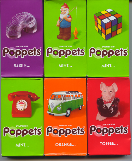
Poppets are yummy chocolate sweets filled with toffee (the yummiest), mint cream, raisins or orange cream first launched in 1937 and they underwent a major lifting last year. I just noticed them so I guess the new marketing plan works well.
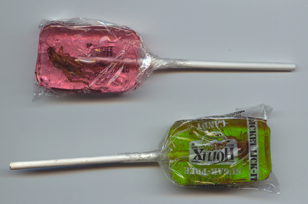
Other candy temptations are sugar-free Hotlix's lollipop with a cricket twist.. I guess, they're surfing on Edible's wave that I wrote about in this blog a couple of years ago ("The last culinary territory to conquest"). I came across the lollipops as they were given away during the Go-North festival, a rock/folk music festival taking place in Inverness this year. I'm not sure I got the obvious link between the 2 themes. Maybe as a hommage to rock bands from the fifties and sixties who bore insect names like the Beatles?
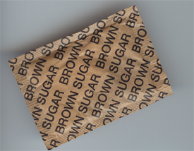
More sugar: I like the straightforwardness of this one.
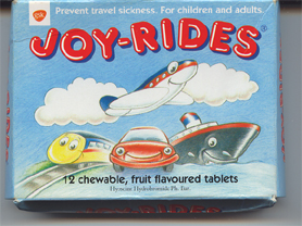
A candy look-and-feel but very medical: anti-travel sickness tablets. The packaging makes you want to ride again and again so you get to take one of their pills and feel so happy to be traveling.
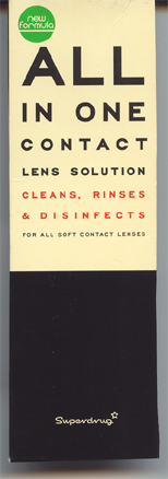
Finally, I've always been attracted to designs that use the famous eye-doctor test board. I know it's a classic but in this case, it's very appropriate. Also, it's the best design ever I've seen for a contact lens solution. And it's made by a chain and they usually don't put so much effort into their own product packages, so it's something to acknowledge.
-- Joëlle.
I had to bring back few samples.
Poppets are yummy chocolate sweets filled with toffee (the yummiest), mint cream, raisins or orange cream first launched in 1937 and they underwent a major lifting last year. I just noticed them so I guess the new marketing plan works well.
Other candy temptations are sugar-free Hotlix's lollipop with a cricket twist.. I guess, they're surfing on Edible's wave that I wrote about in this blog a couple of years ago ("The last culinary territory to conquest"). I came across the lollipops as they were given away during the Go-North festival, a rock/folk music festival taking place in Inverness this year. I'm not sure I got the obvious link between the 2 themes. Maybe as a hommage to rock bands from the fifties and sixties who bore insect names like the Beatles?
More sugar: I like the straightforwardness of this one.
A candy look-and-feel but very medical: anti-travel sickness tablets. The packaging makes you want to ride again and again so you get to take one of their pills and feel so happy to be traveling.
Finally, I've always been attracted to designs that use the famous eye-doctor test board. I know it's a classic but in this case, it's very appropriate. Also, it's the best design ever I've seen for a contact lens solution. And it's made by a chain and they usually don't put so much effort into their own product packages, so it's something to acknowledge.
-- Joëlle.
Labels: Design, Graphic design, Packaging design
![]()
